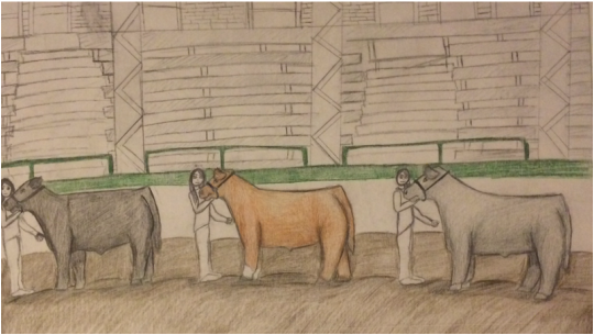
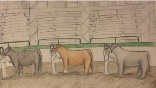
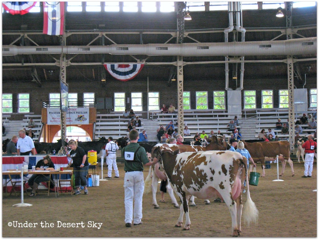
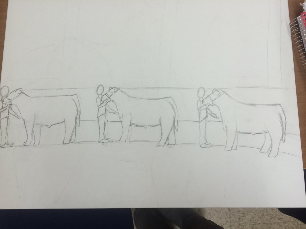
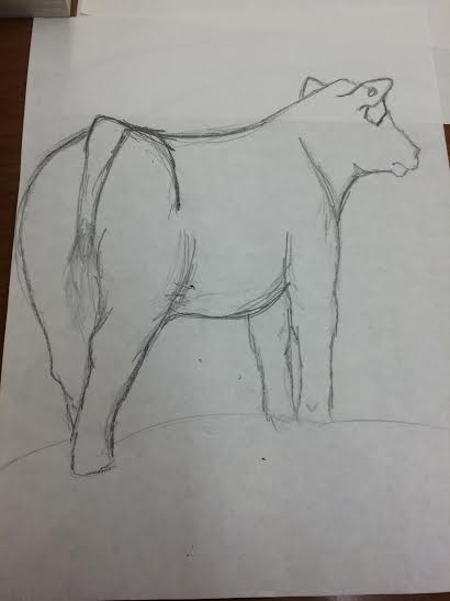
Even thought its not fully competed, I think it looks pretty good. it will be totally completed in my digital portfolio. This project was one of my favorites. It is closely related to me because I show cattle and livestock. My family shown livestock when they were young. I named this "Champion Drive" because its the final show where all of the champions come in from all of the other classes and try to win the whole thing. I have been in this situation before and it is awesome. Its even more cooler to win it. I chose the back ground from the Iowa State Fair at the pillion. It was difficult to draw the people so small. The details were a little difficult too. I really like how this one turned out.
On my peer critique, I changed the people look more natural and less stiff. I added some people in the stands so it looks like bleachers so its not mistaken for fences. Its coming out how I want it to look like. I think that it is going to turn out really well when it is totally finished. I also made the people's heads proportional to their bodies. I decided to change from painting to using colored pencil so I could get the detail in it.
I chose to use mat board for my picture. I wanted to use paint again for this project because I like using paint. I chose to paint a picture of people showing cattle at the Iowa State Fair. the people showing cattle are in the pavilion at the Iowa State Fair. I used pictures from the internet of the inside of the pavilion. It was difficult to draw the people showing the cattle. I don't usually draw people so it took me a bit longer. It was also difficult to draw the bleachers and stairs in the back ground. I want the picture to look as accurate as the original picture. I'm going to color the steers different colors like black, smoky gray, and dark redish. I'm going to call this project "Champion Drive".
So I decided to change my project idea. I wanted to have several steers with people in it. The back ground will be the pavilion will be from the Iowa State Fair. The steers will be different colors and the people will be different. I'm going to call it either the champion drive or the final drive. I want the back ground to look exactly like the pavilion at the Iowa State Fair. I have shown cattle there before so i have a deep connection with it. The Iowa State Fair is more like a second home. I go every year ad stay all 11 days. I always go an watch the cattle shows so I can learn new things.
For my next project I wanted to draw a show steer from the back side. I wanted to use different shades of purple to color and shade the the steer. the back ground will be black or gray so the steer stands out. The purple will be a royal purples. I chose royal purple because its the color of grand champion ribbon. Even though I have done a cow art project, but i haven't done a steer art project. I have a strong connection with this one because my family has been showing livestock when they were kids. Showing cattle is a major part in my life and I enjoy every minute of it.
In my Drawing and Painting class, I had to draw popcorn that my teacher gave to me. I couldn't eat the popcorn I just had to observe it and draw it. I drew the popcorn on a white piece of paper, a gray, and a black piece. I had to shade all of the shadows and lighten the lights. I thought that this practice was sort of difficult. This practice took a lot of time to figure out. I did though think that this practice did help me. Drawing the popcorn was hard to draw because it was so small and it was hard to find all of the shadows.
In my Drawing and Painting class, I had to draw with all my different types of drawing pencils from light to dark. It was a shading chart and I used pencils, ink, ink pen, and charcoal. This was pretty easy once I got the hang of it. The hardest one was the stippling with the ink pen. It took a lot longer than the rest of the other ones. Drawing with the ink and calligraphy pens was really fun. I used the pink ink to do my shading and my cross hatching. I enjoyed this activity and I thought it helped my understand shading a lot better.
I started my project by drawing the horse profile that I wanted. I wanted the horse head to be large so it filled up the board I was drawing on. When I finished drawing the horse, I started drawing the Aztec designs on its face. I wanted the designs to look like tattoos. i mixed colors together to create a salmon pink color, a light turquoise color, and a khaki color. I wanted the horse to be a mix of light browns and dark brown. The hair will be black or a light brown but i haven't decided on the that yet.
For my next project, the materials I wanted to use is acrylic paint for the coloring and I wanted to use matt board for what my drawing will be on. My paint colors will be light blue, light pink, light brown, black, white, and dark brown. I didn't want to use paper like all of my other projects. I used the same ideas that I did with the figure practice drawing and the profile drawing. I used a point of measure to accurately locate the parts of the horse. I used the horse's nose to measure. I wanted this project to be vertical and be a slim picture .
For my next project I wanted to draw a horse head with Aztec print on its face. I wanted it to look like a tattoo rather than just patterns across its face. I wanted to use hipster Aztec pattern and old Aztec pattern. I wanted to use light blues, light pinks, black, white, light brown, and dark brown. The horse will be facing forward and it will have long flowing hair. The project will represent "wild child" because of the Aztec pattern and long flowing hair.
|
AuthorHey, hope you enjoy my blog. As you can tell I like horses! enjoy my blog!! Archives |