Line Drawing :
|
Positive and Negative Spaces
|
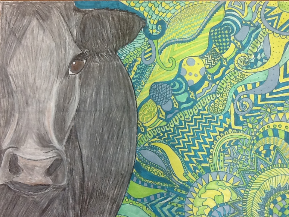
Materials: black and white charcoal pencils, red and black acrylics, yellows, blues and greens markers.
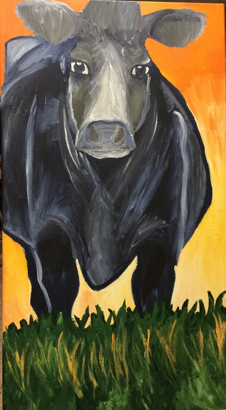
Date: 10/7/14 In my Drawing and Painting art class, I wanted to draw a picture of a cow. I wanted to draw a cow because I think cows are so adorable and full of personality. The reason why I labeled this art work as Colorful Personality was because I think that cattle have a personality to them. Most people think of cattle as dumb, stupid fat blobs that we eat for human consumption. My uncle has cattle and I can see that each cow and calf have their own personality. Cattle are curious creatures and I think that their mind works in a million different ways. That is why I gave the back-round for this cow was a colorful zentangle. I chose the back round colors for a reason, I chose blues, yellows, and greens to represent agriculture for my art work. When I started to color my cow , I wanted it to look as realistic as possible. I wanted the cow to pop from the zentangle back-round. I used black and white charcoal pencils and red and black acrylics. I used a reference photo from a website called Steel Cow. I wanted my cow to have facial definitions and lights and dark areas . This art work means a lot to me because I have lived my whole life on a farm. I have been around cattle and have seen their own personalities. I think cattle have a wild imagination like I do. This is probably my most favorite cow drawing that I have ever done. Value
Painting 1: Battle Cry
Materials: Acrylic paint, pencil, and acrylic paper.
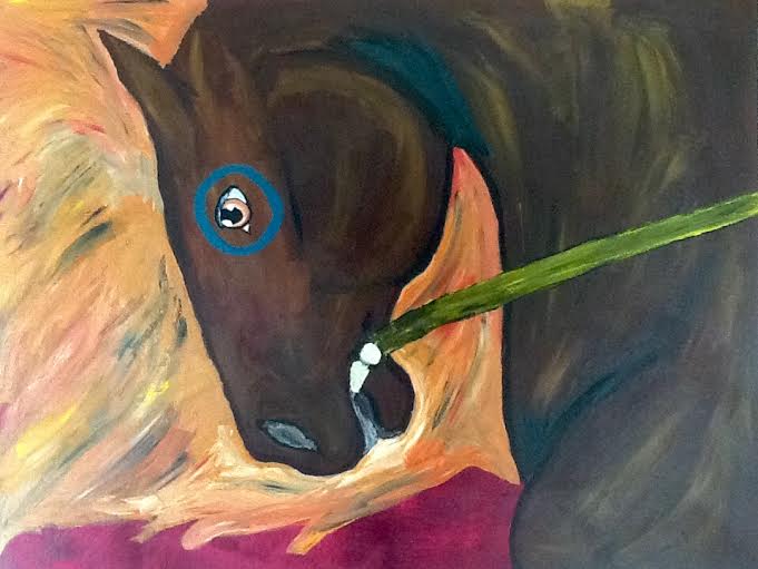
Date: 3/5/15 For my first painting project I wanted to draw an native American war horse. I wanted the horse to have a lot of facial expression. I wanted it it show power and strength. The colors I chose were warm, bold colors like oranges, reds, and yellows. The horse is brown but it has some color streaks of yellows and oranges. I added some white and some darker browns so the hair and the body wasn't to bright or to dark. The paper that I used was the acrylic paper. It is a bit thicker and a bit heavier for the paint. I like using this paper more than the canvas. I wanted to communicate power and strength because I have been taught that I shouldn't let people pull me down. I am the one in control of my life and I should be able to stand up for myself. We have are own inner strength. |
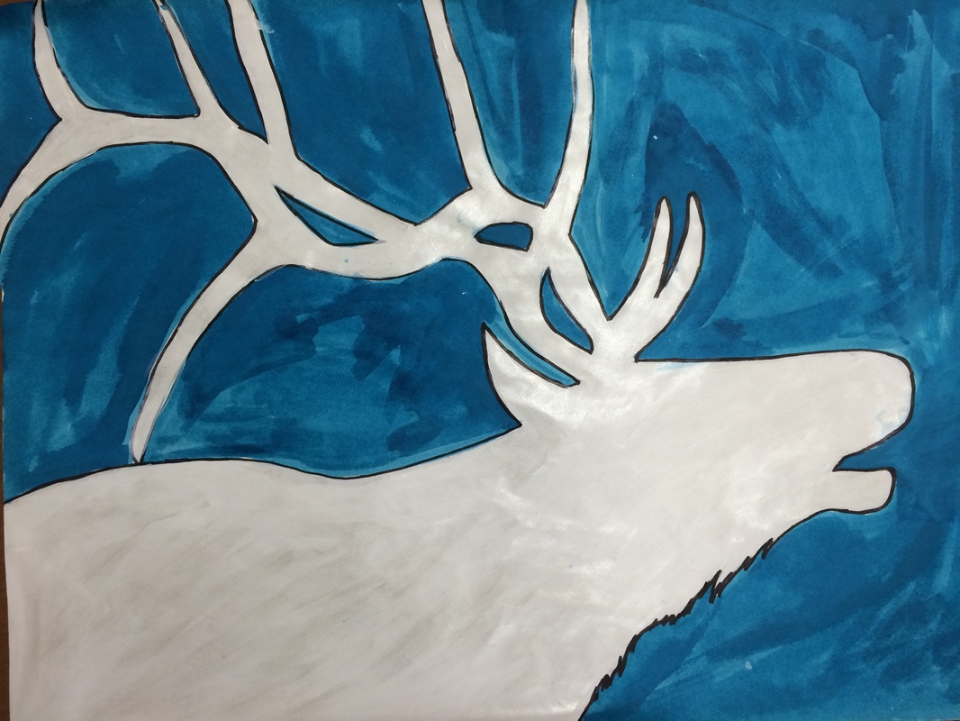
Materials: Blue ink, black sharpie, drawing paper, white acrylic paint, and pearl acrylic paint
Date: 10/17/14 In my drawing and painting class I wanted to draw and elk head for the positive and negative project. I wanted the elk to look big and powerful. I also wanted the background to look cold like winter. I wanted it to look like this because winter is one of my favorite seasons. I wanted the elk to be white but I didn't want it to look plain and flat. So I added a shimmery pearl paint to it to give it a little pop. I wanted to give my project an icy, cold feeling from it. I have never used colored ink before. I have used it one time when I was in art foundations. I used a paint brush to paint the back ground for my project. I also wanted the elk to look like he was breathing so I tried adding rubbing alcohol to lighten the blue so i could see breath. The bad thing though was that it was not successful and it just made the paper really wet. Overall I really like how it turned out. I love how the elk turned out and the back ground. Perceiving relationships
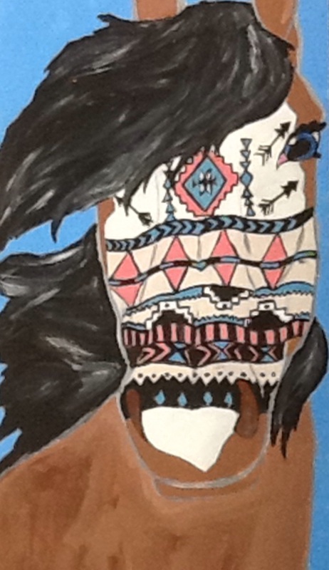
Materials: Pencil, Sharpie, acrylic paint, and mat board.
Date: 11/17/14 For my project three drawing I wanted to draw a profile of a horse's face with Aztec designs on it. I wanted the Aztec designs to look like a tattoo on the horse's face. The hair I wanted it to be long and flowing in the wind and the body color would be a dark but a soft brown with white face. I wanted this project to communicate wildness and spirited. I called it "Wild Child". I chose the Aztec designs because I thought that it would fit with what I was trying to communicate. I chose the horse because it is one of my favorite animals. There wasn't much of a back-ground because I chose my project to be vertical and slender. This project means a lot to me because I have always loved horses since I was a litter girl. I chose the name "Wild Child" because I a wild one when I was little. I wanted the my artwork to feel warm because my favorite time of the year is summer. The reason why I used the Aztec pattern was because I thought that it fit the project and what I was communicating. Blue Cow
I decided to paint on canvas in my painting class. I painted a blue roan cow with a yellow/orange sunset for the background. The canvas was 20x34 and it stood vertical. I used acrylic paint. The cow faced forward as if looking at something. She stood in all green grass and had an orange sunset. I wanted this painting to look like it was a warm summers evening. The grass is all and green and all the cows are on the pasture grazing all day. I tried to make this cow look as realistic as possible. I worked on getting the correct shading in the right places. I used reference photos from Steel Cow. I changed my idea on the background. It was originally going to be a lighter blue but it looked to sad and sunk in. So I changed it to a yellow orange color.
|
